Big Mug Coffee Roaster Redesign

Making coffee easier

Overview

What Is This Project?
Big Mug Coffee Roaster is a coffee company and collection of cafes. There is no existing app for Big mug Coffee Roaster and its online ordering process is flawed, so I designed a Big Mug app and redesigned their website.
My Responsibilities
  • Competitive audits
  • Paper & digital wireframing
  • Low & high-fidelity prototyping
  • Usability studies
  • Accounting for accessibility
  • Iterating on designs
  • Launching product
My Role
UX Designer, UX Researcher
Tools
Figma, Procreate, Square, pen & paper

The Problem

Big Mug’s online ordering system is conducive to errors. It is already difficult and confusing for users to order coffee with its abundance of choices, however, Big Mug's current ordering experience makes the process even more inefficient with its disorganized menu categories and contradictory modifiers.

The Outcome

Improve upon the usability of the online ordering system for Big Mug and reduce order errors.

A peek at the solution

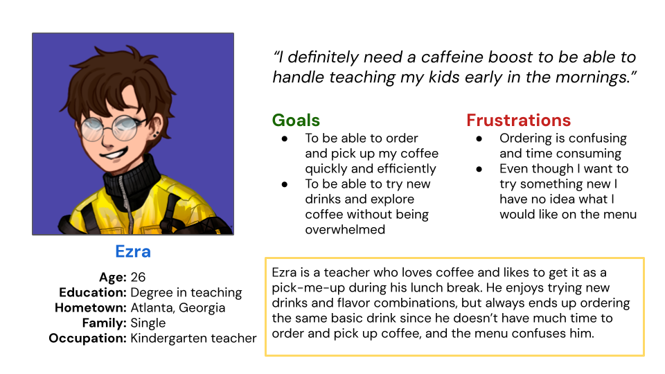
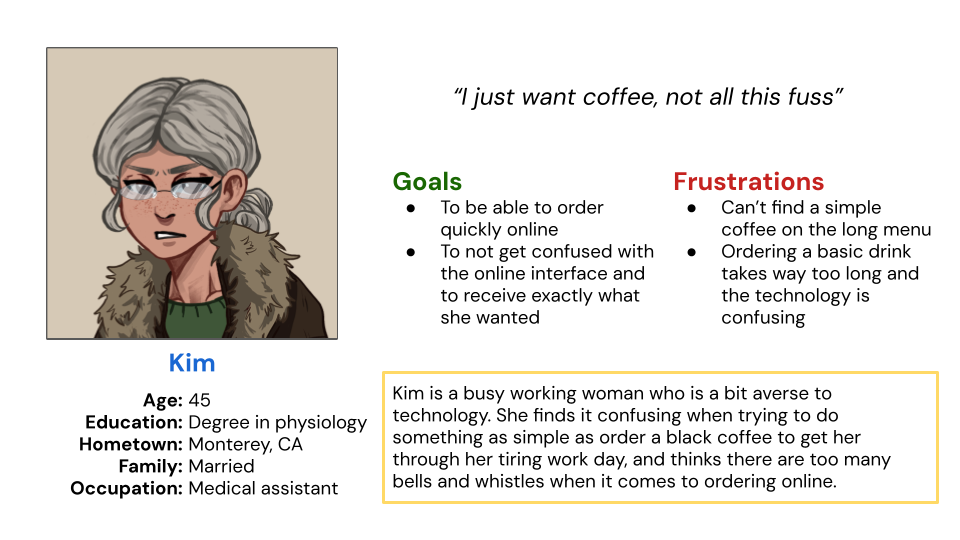
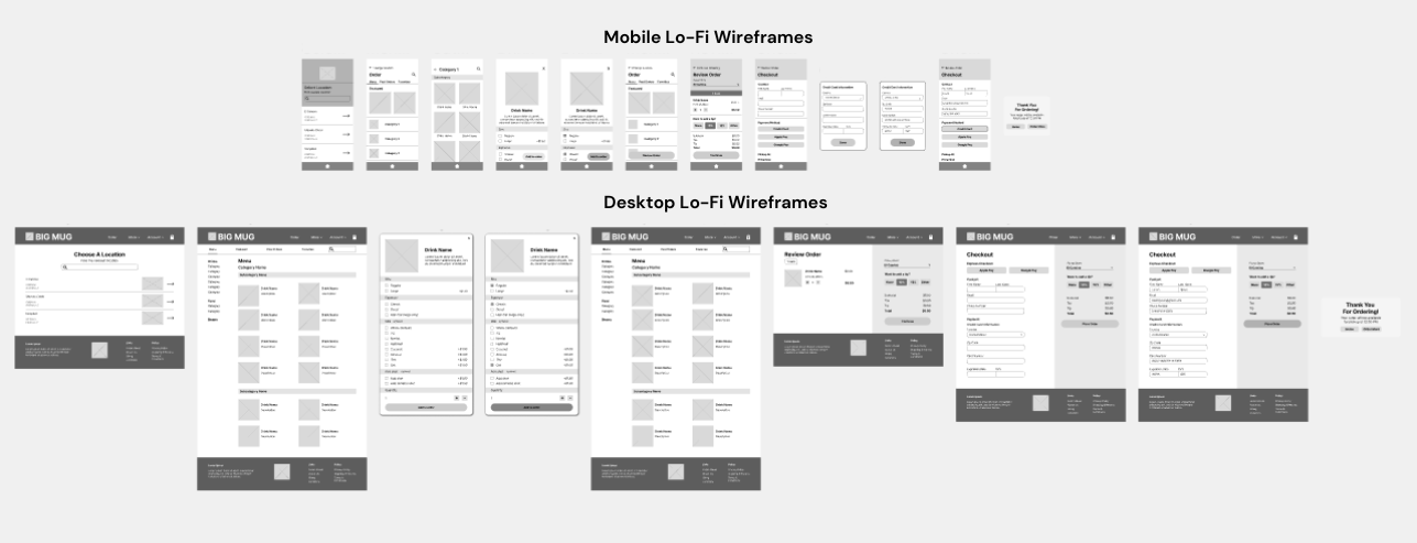
Room For Improvement

Since we are redesigning Big Mug’s ordering process, it was crucial to first identify what needed to be improved upon. If we take a look at the old website and remember the pain points from the user research,  the issues are glaring.
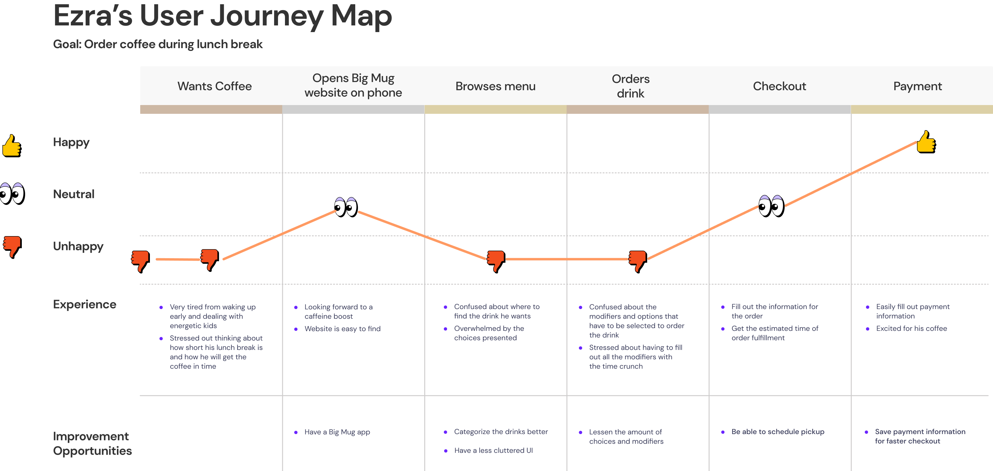
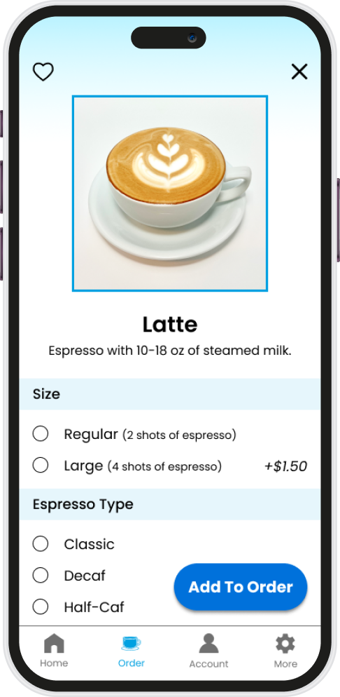
1
Confusing Modifiers
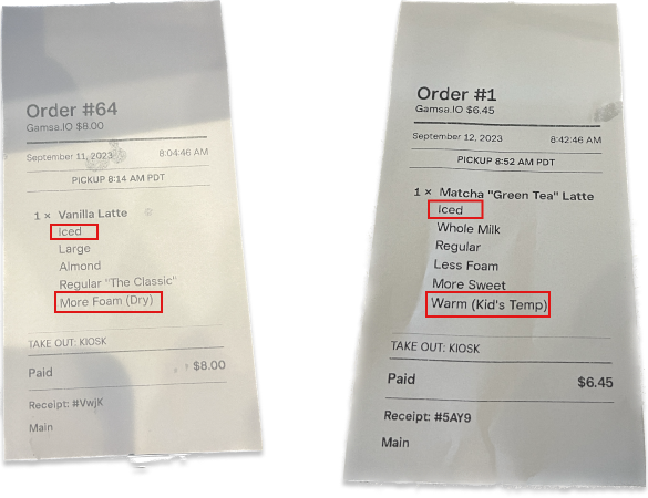
Pictured above are receipts ordered by confused customers, leading to confused baristas. Let's take a look at the designs that lead to such common and avoidable mistakes.
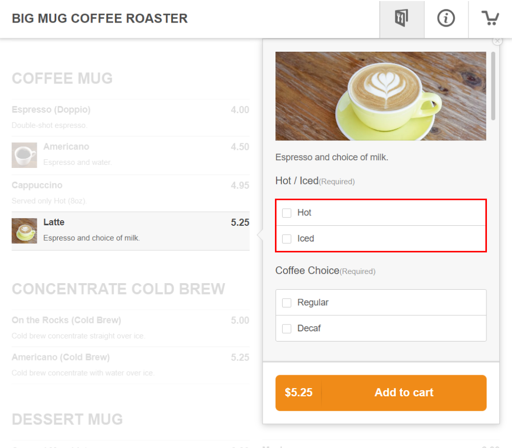
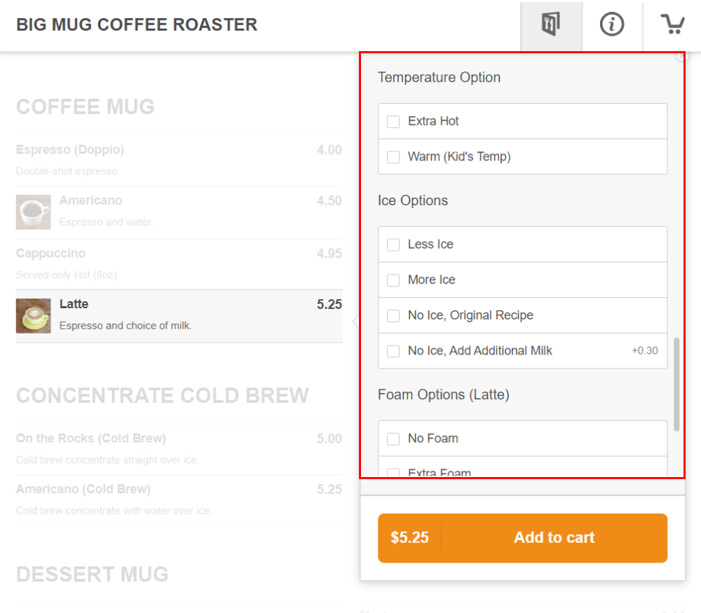
Due to the current design, the modifiers can get quite confusing. People often fill out both the 'temperature' and 'ice options' when the 'temperature' option should only be filled out for hot drinks, and the 'ice options' should only be filled out for iced drinks. Additionally, the 'foam' option only applies to hot drinks since we steam the milk.
2
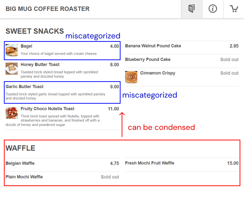
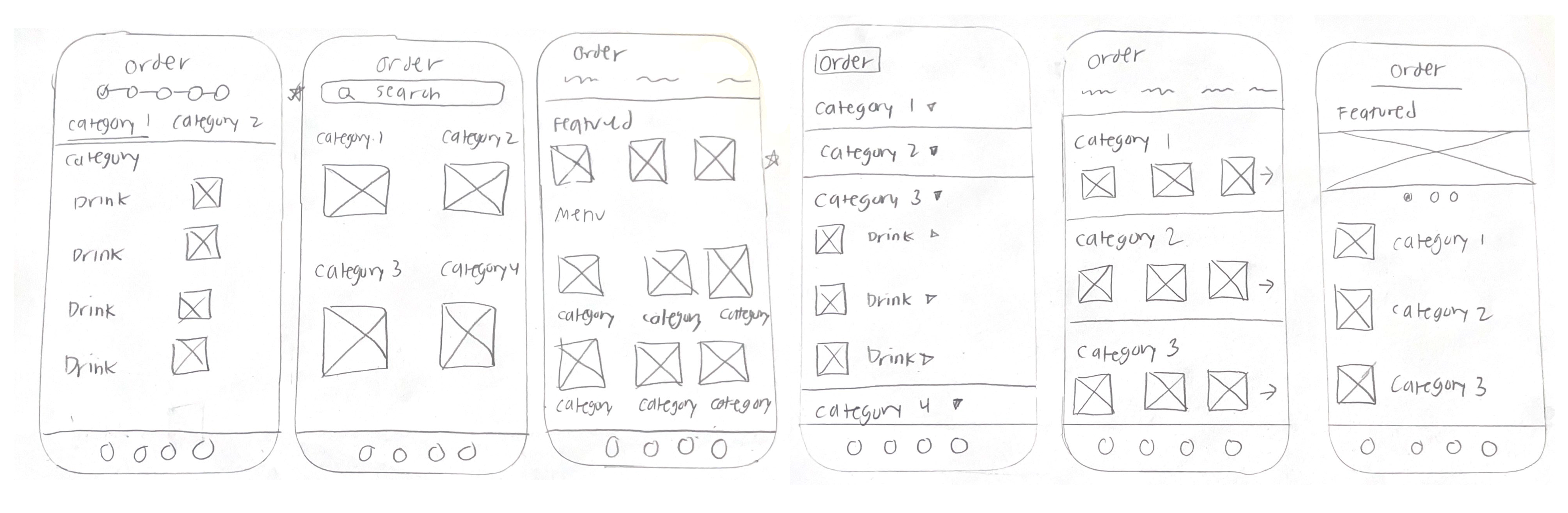
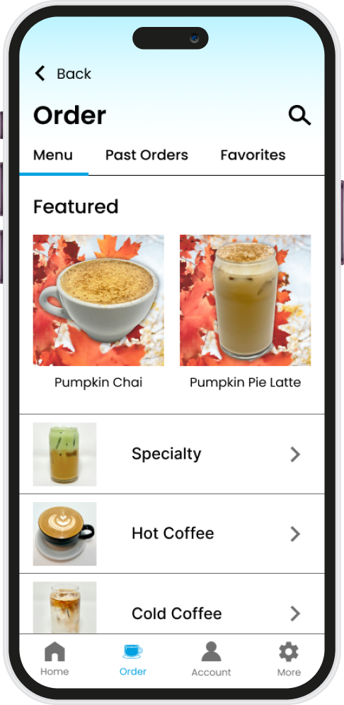
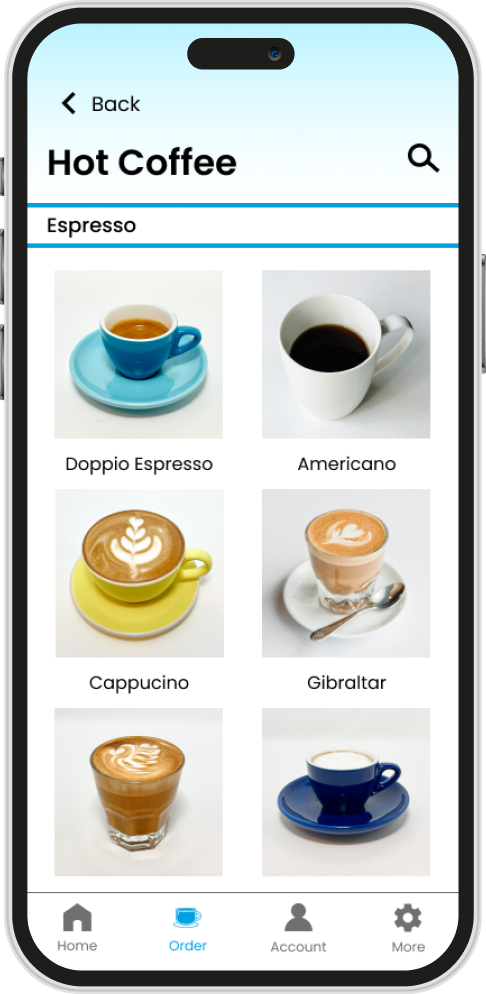
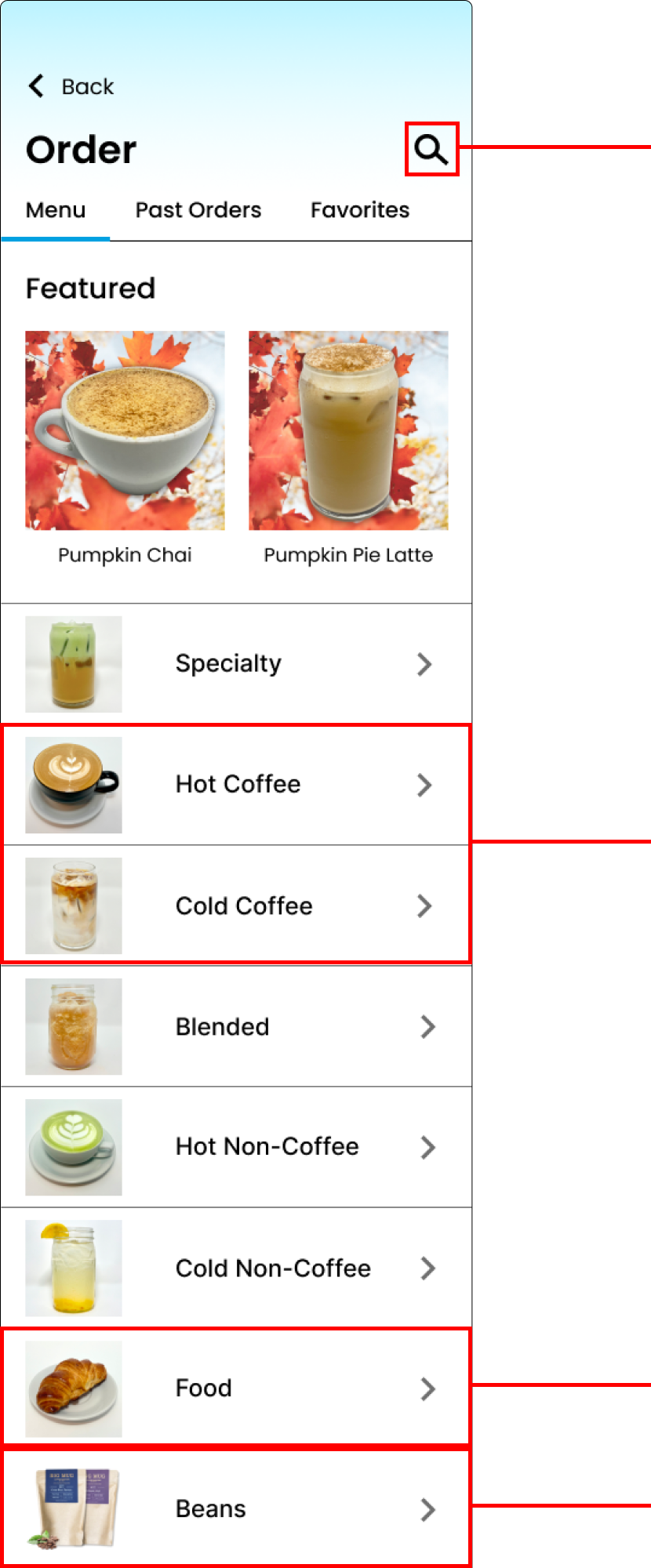
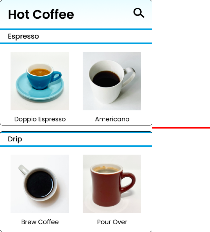
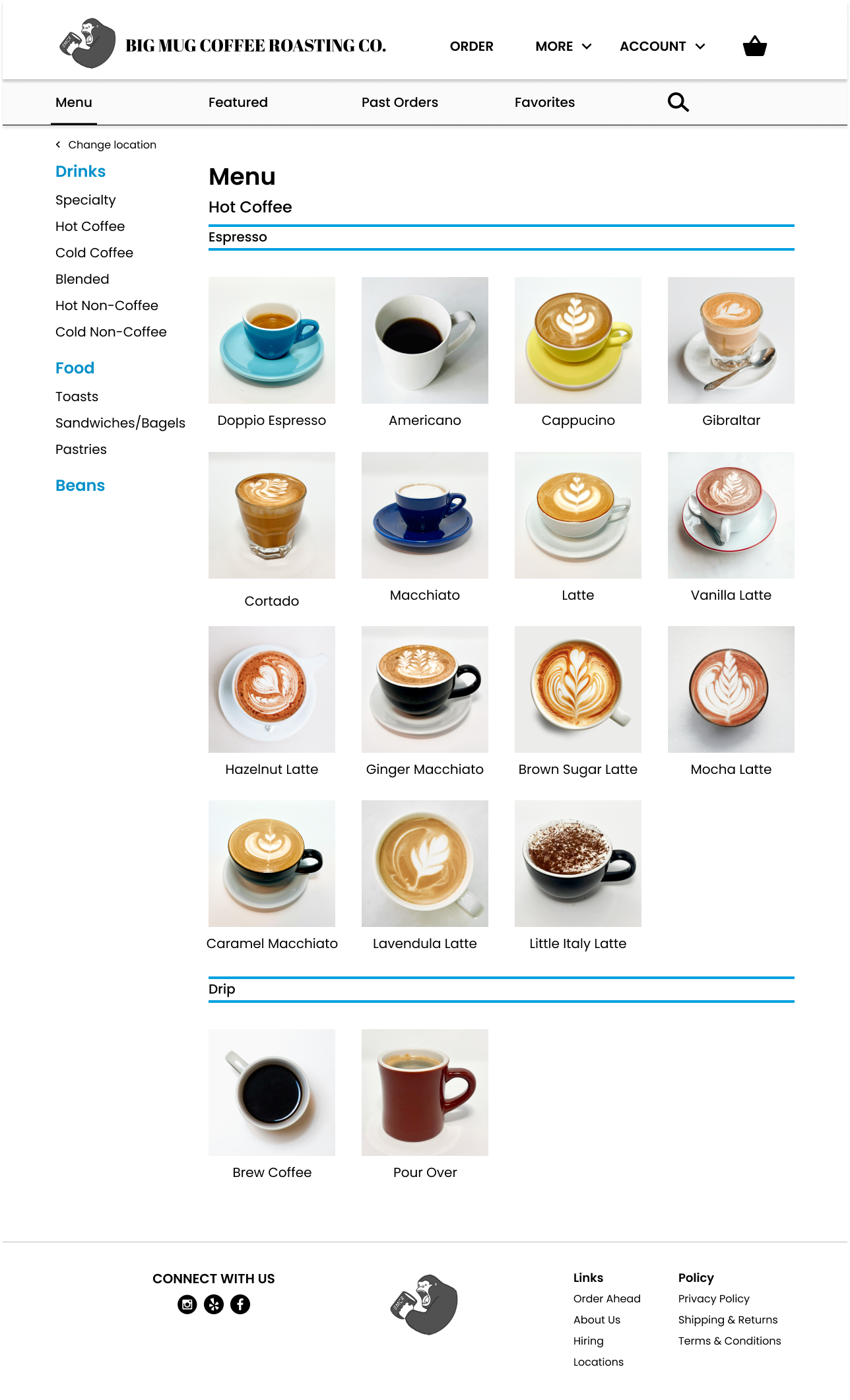
Categorization of Menu Items
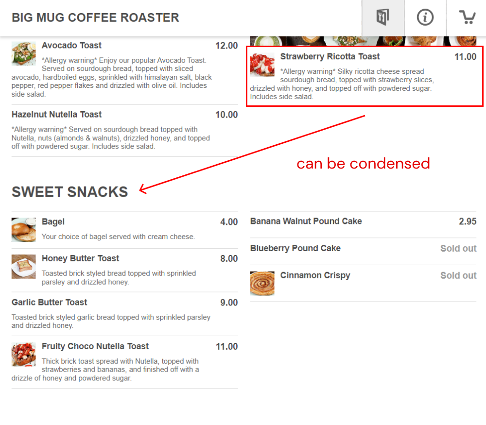
The categorization of our food items are very disorganized. As seen as in the images, a lot of our menu items are either miscategorized or can be condensed.
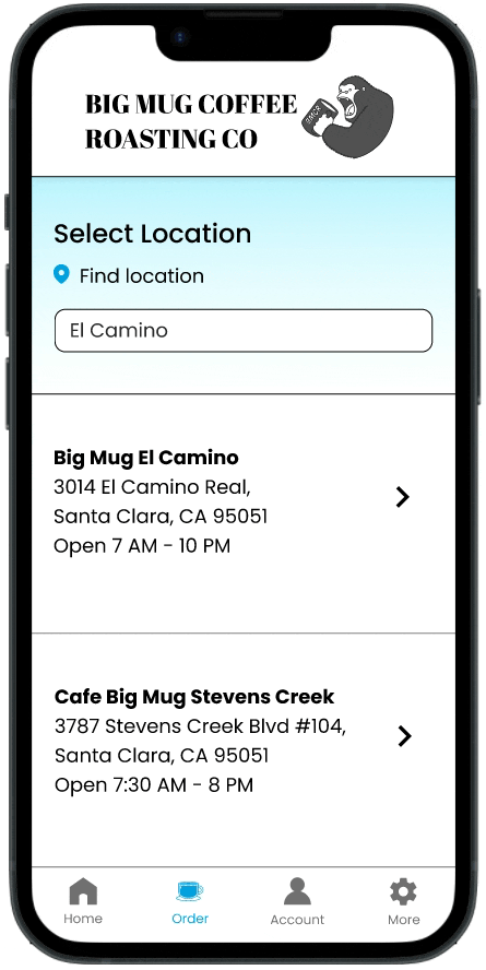
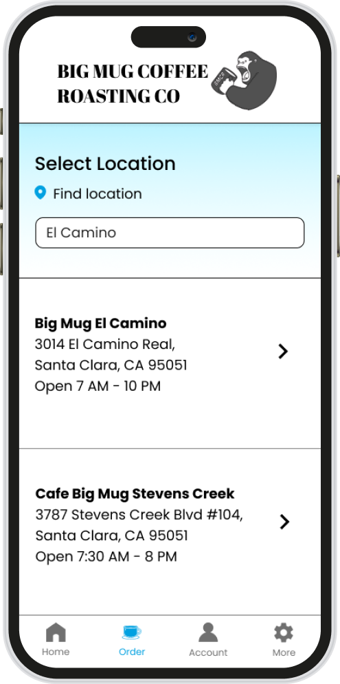
3
Look & Feel
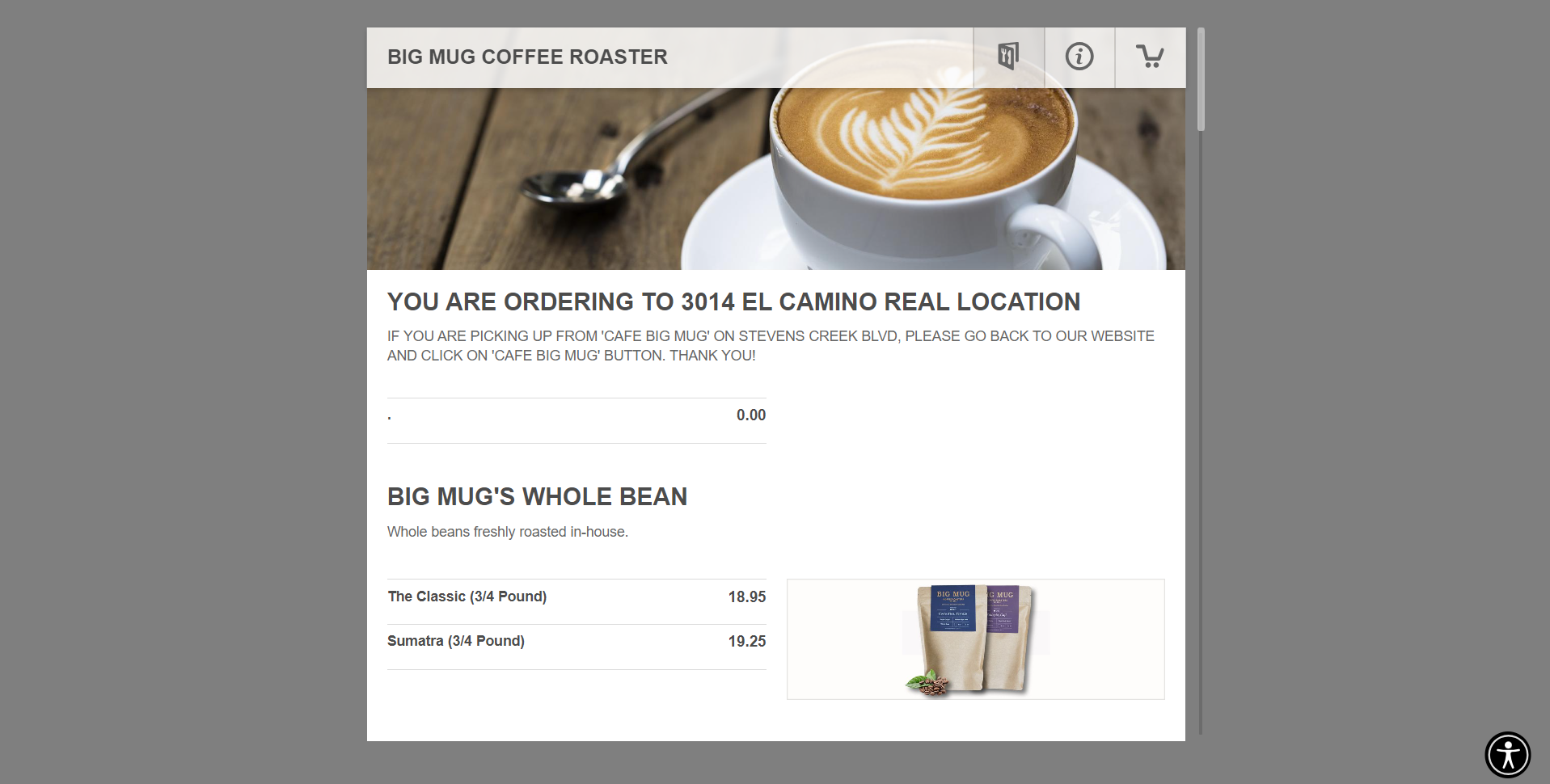
Big Mug’s Ordering page lacks any branding and personality. The fonts, lack of color, and layout can greatly be improved.

Understanding The User

As a barista at Big Mug's busiest location, I have a deep understanding of the users and how orders are received and fulfilled. I surveyed 20 customers and 3 baristas about how they feel about Big Mug's ordering process.

Using my data, I created user personas to represent these customers.
I also created a user journey map to detail each step the user takes in ordering a drink at Big Mug to better understand how the user experience can be improved.
Through user research, here are the main pain points identified.
1
Confusion
Coffee is confusing. There’s espresso, drip, cold brew, pour overs, lattes, cappuccinos, etc. The current layout and verbiage of Big Mug’s ordering system cdoes not aid in making coffee a digestible concept.
2
Order Error
The modifiers on the drinks seem to be confusing customers the most, leading to users customizing their drinks wrong.
3
Inefficiency
Ordering coffee on Big Mug’s website is not the most efficient. There are a lot of menu items and many times customers call saying they cannot find what they are looking for.

Competitive Audit

Here is the competitive audit for Big Mug. I summarized the key findings here:

Ideation

The ideation of Big Mug’s ordering process consisted of visualizing what the app and new desktop ordering process would accomplish for its users through a storyboard, and laying out the user flow of ordering that will be the most natural for customers.

Solutions + Design Process

Before even starting a file, I organized the categories for the menu items since that seemed to be the solution to the biggest point of improvement on the redesign.
The biggest but simplest change was separating the drinks into hot and cold categories. After surveying users, the first decision users make in ordering is deciding if they want a hot or cold drink, so this architecture will follow their natural flow. It will also reduce order errors by removing contradictory modifiers in the drink customization process.
I sketched out some wireframes on paper, mostly focusing on the main menu screen.
The next step in designing was creating a lo-fi prototype for both a possible mobile app for Big Mug and Big Mug’s web ordering process.

Mobile App

Some high fidelity mock-ups
Key Solutions
A search function will improve efficiency in the ordering process for a lot of our regulars who always order the same thing. If we were to have a mobile app and customers could create accounts, having a past orders tab and a favorites tab will also be effective.
The biggest change was to separate hot coffee and cold coffee into different categories. Despite it being repetitive (a lot of our drinks can be offered hot AND cold), our customer tends to first choose what they want to drink by deciding if they want something hot or cold. Separating the drinks by hot and cold will also streamline the customizations for the drink later. No more extra hot or foam options on an iced drink or ice options on a hot drink.
Since our focus is on our drinks as a cafe, food was consolidated into one category. Categories in general were reduced for customers to not be overwhelmed.
Beans were moved to the bottom since that is the type of item we sell the least.
Subcategories determined by brew processes guide those who are more knowledgeable in coffee. Not everyone can tell espresso apart from drip, but those who can and want to will be able to with the subcategories.

Desktop Product

Some high fidelity mock-ups

My Takeaways

1
Strategy In Organization
With this project specifically, I really learned how the organization of elements is crucial for the usability of the product. Customers have often complained to me about not being able to find and therefore order what they want. Just by reorganizing categories, the product can become substantially more usable.
2
Business vs Design
A lot of UX Designers struggle with keeping the balance between what the users want and what the business wants, as sometimes they are not exactly the same. I began to understand this struggle with this project in particular, but I learned that ultimately the priority should be in the users being able to navigate the menu.
3
Knowing the User
Of course, the user is always central to design in UX, but this project I knew the user very well, so I got to learn firsthand how vital understanding the users is. I was able to make decisions confidently and precisely with my assurance that I knew my customer base well. Just by working as a barista I am conducting "user research" constantly, which really aided in completing this project.