Blooming Website

Making the shopping experience as pleasant as the flowers yore buying

Overview

What Is Blooming?
Blooming is site for a hypothetical flower shop and delivery service designed to be desktop and mobile friendly. It is a site that makes ordering flowers simple, efficient, and easy.
My Responsibilities
  • Competitive audits
  • Paper and digital wireframing
  • Low and high-fidelity prototyping
  • Usability Studies
  • Accounting for accessibility
  • Iterating on designs
My Role
UX Designer, UX Researcher
Tools
Figma, AdobeXD, Google JamBoard, pen & paper
The Problem
Buying flowers can be unpleasant and stressful. There isn’t always the convenience of traveling to a brick and mortar flower shop, and retail stores that sell flowers (but not exclusively) often have a sparse selection. Online flower shops are often difficult to navigate, disorganized, and have an outdated look.
The Outcome
Design an online flower shop with a contemporary feel that is easy to use on desktop and on a mobile device. With a clean and aesthetically pleasing design, users should feel that buying flowers to commemorate special occasions is enjoyable and accessible.

A peek at the solution

Understanding The User

I conducted user interviews in which I asked participants what their gripes are with buying flowers online and in person, and what features they’d like to see to make their shopping experience easier to navigate.

With my notes, I created a user persona to represent the primary user.
Here are the pain points identified in user research that my design aims to solve:
1
Accessibility
Many people do not have the convenience or ability to travel to a brick and mortar store to purchase flowers. Even many online flower shops cannot be accessed through a phone.
2
Experience
Flower shops in real life can have a sparse selection to choose from and do not guarantee fresh flowers. Online flower shops are often overwhelming with its difficult to navigate layout.
3
Look & Feel
Since flowers are a somewhat niche business online, many existing online flower shops are clunky, outdated, and not pleasing to look at.

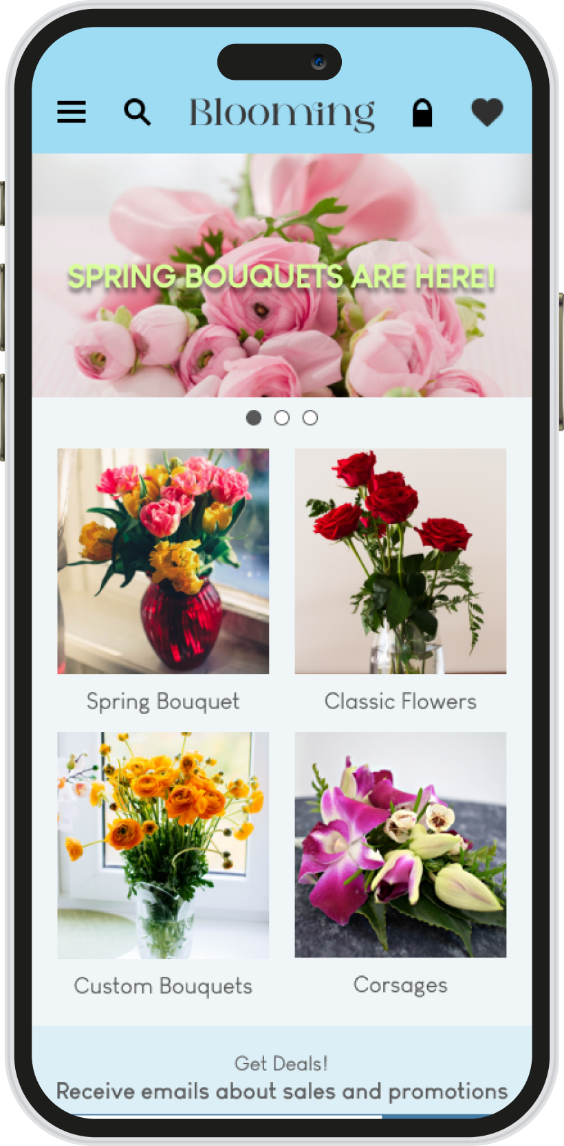
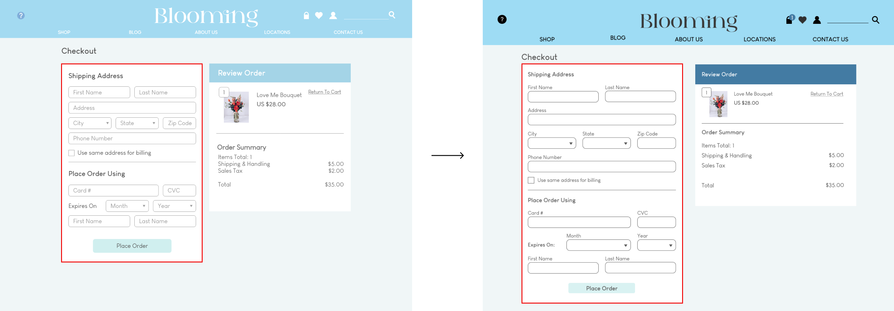
Inspiration & Competitive Analysis

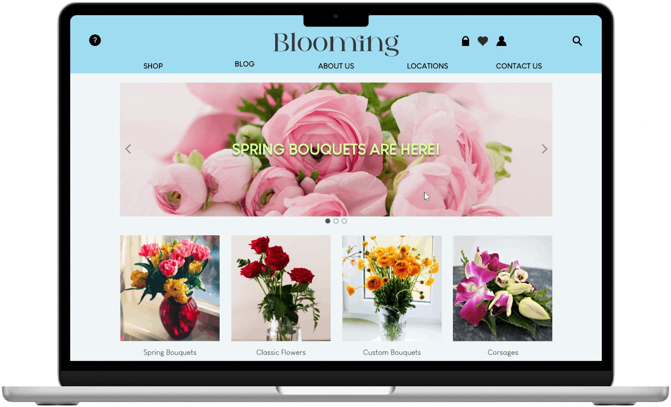
One of the main goals for the design of Blooming was that it was supposed to feel cleaner and more contemporary than its competitors. When delving into the competitive analysis, it was apparent how online flower shops could be improved upon.
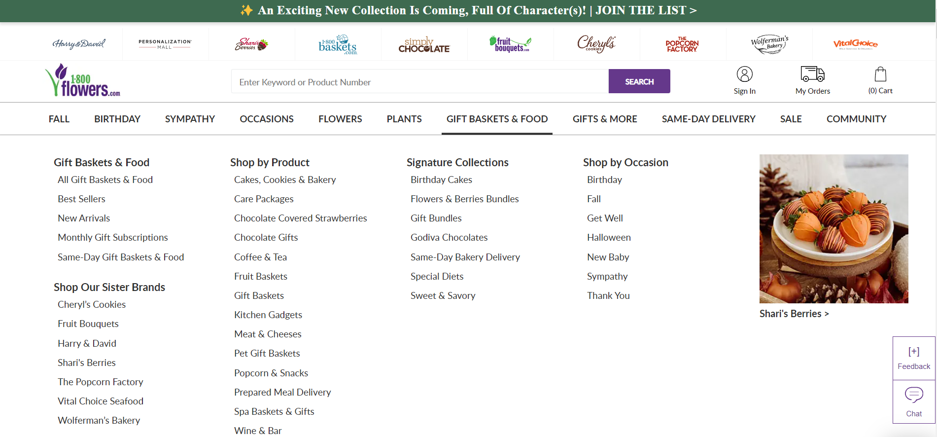
One of our biggest competitors, 1-800 Flowers, has an overwhelming homepage with cluttered and overcrowded categories, which is what Blooming wants to avoid.
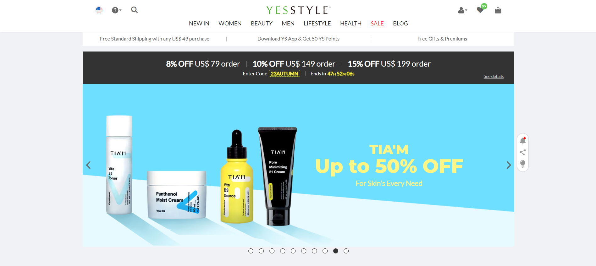
Yesstyle was a big inspiration to this project. They sell a myriad of products but still manage to have a very simple and clean design that is inviting to explore.

Information Architecture

The Information Architecture supports the primary user flow of ordering flowers efficiently. The shop domain with its simple categories allows users to browse freely without getting overwhelmed, and the cart domain presents a linear and clear flow that will allow users to easily make their purchase.

Design Process

Wireframe sketches, low-fidelity wireframes, and prototypes were made in order to create a simple yet visually stimulating design and test how natural the user flow would be.

Iterations

Desktop Product

Some high-fidelity mockups

Mobile Product

Some high-fidelity mockups

My Takeaways

1
Responsive Design
This is the first project I’ve done in which I designed for both desktop and mobile screens. It was like a fun puzzle, figuring out how to take the same content and lay it out on its respective page sizes while maximizing usability. I took a graceful degradation approach to this project, and strategically deciding what content I wanted to emphasize or even delete for the mobile version of the site was an interesting challenge.
2
Accessibility
Accessibility was a huge consideration for this project as one of the main goals for Blooming was that it made buying flowers on this site more attainable than buying them in-person or on other sites. I researched and became more knowledgeable in contrast definitions, universal symbols, and accessibility standards, which is so important in progressive design.
3
Layout
With Blooming’s different pages containing various column and row amounts, I became a lot more familiar with grid layouts and thinking strategically about the placement of my content in order to keep the user engaged and to deter them from being overwhelmed. Organization matters in accessibility, and that should be reflected in design.