Studio Schedule App

The app that helps you manage

Overview

What is Studio Schedule?
Studio Schedule is a staff scheduling app for a dance studio. The app aims to allow studio managers to easily build schedules for their staff and send them out.
My Responsibilities
  • Competitive audits
  • Paper and digital wireframing
  • Low and high-fidelity prototyping
  • Usability studies
  • Accounting for accessibility
  • Iterating on designs
My Role
UX Designer, UX Researcher
Tools
Figma, Google JamBoard, pen & paper

The Problem

Studio managers don’t have an easy and efficient way to organize classes and communicate with staff.

The Outcome

Design an app for studio managers to easily create and share staff and class schedules.

A peek at the solution

Understanding The User

The primary user group for this app are managers or owners of studios, primarily dance studios. As someone in the dance community, I conducted user interviews with some dancers and directors to identify what would be intuitive for my users in creating schedules.

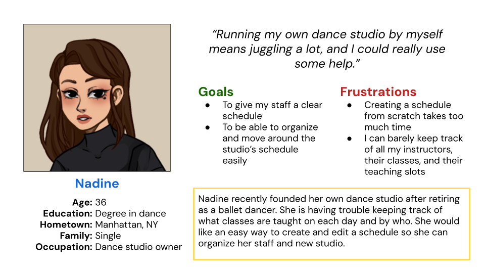
I created some user personas to represent the target users.
I also created a user journey map to detail each step the user takes in building a staff schedule to better understand what the user experiences and feels and what their needs are.
Through user research, here are the main pain points identified.
1
Accessibility
Studio managers do not have the technological ability to lay out schedules from scratch.
2
Time
Writing out staff schedules from scratch is redundant and incredibly time consuming.
3
Cost
Most other studio managing programs are very expensive.

Competitive Audit

Here is the full competitive audit for Studio Schedule. I summarized the key findings in noticeable gaps in the market.
Gaps:

Ideation

The ideation of Studio Schedule consisted of visualizing what the app would accomplish for its users through a storyboard, and laying out the primary user flow one would experience in the app.

The Design Process

After laying out the user flow, sketching out paper wireframes was next.
From there, low-fidelity wireframes and a prototype were created.

Iterations

After conducting a moderated usability study and gaining valuable feedback, I made changes to Studio Schedule to increase usability and make the design pop more visually.

The Final Product

Some high fidelity mock-ups

Visual Identity

My Takeaways

1
The Design Process
This is my first ever UX project, so I learned (through doing) about the importance of every step in the UX design process.
2
The User
Through this project, I learned the importance of user-centered design.  Empathizing with users before even beginning to design, and then later gaining feedback from usability studies and implementing that in the final product made the design process and its impact clear.
3
Animations
The overall design and navigation of the app is quite simple and clean in order to be accessible by those not the most versed in technology. Therefore, through Studio Schedule, I learned to utilize animations to liven up the user experience.